Monday, December 8, 2014

Sally Hansen Diamond Strength Diamonds and Rubies

Only one photo because the bottle shot color was inaccurate
I figured I had enough red cremes, and only purchased Diamonds and Rubies on clearance at Ulta as a Christmas present for a friend last year. A few days later, she complained to me about how a monthly subscribed cosmetics box had sent her "another red", which she was tired of. I thought, "Oh?" and went back to Ulta and bought her some snazzy Zoyas and kept Diamonds and Rubies for myself.

It's a nice red! A classic retro shade with a very easy formula. One coat for a bright and almost completely opaque color, two for deeper (but not deep) and full coverage. This is my first time using the Diamond Strength line, and I love the firm, skinny (that's what she said) brush. Normally while applying a red creme, the polish would run everywhere and stain my skin, but not so with this brush. It led to a very easy application.

The most similar red in my collection is Zoya Sooki; Diamonds and Rubies is darker, though perhaps not substantially. I may be the only person in the nail cult world who isn't a fan of Sooki despite its cool cherry tone, because my bottle has a jelly formula requiring three coats for an even color, and 2 coats versus 3 leads a very different shade, so god help you if you get your polish amount uneven nail to nail.

Diamonds and Rubies chipped during my second day of wear after two hours of book-handling at work. That job is often hard on nails (I make sure I keep them painted partially to protect them), though the OPI manicure featured in the last post held up strong against it. OPI is tuff.

In addition to this, my other favorite retro red creme is Zoya America, which is lighter and brighter.

Sunday, December 7, 2014

OPI Do You Have This Color in Stockholm? and OPI Snow Globetrotter

 OPI Do You Have This Color in Stockholm? is one of those indigo "blurples" that you are never going to get a color-accurate photo of. Under indoor lights, it can appear to be a darker blue. Then you take it outside, and WABLAM, you have a bright-ass indigo. When I took this photo, I actually had overcast outdoor lighting that made it look like the radioactive indigo it is, a neon purple compared to the Sinful Colors Endless Blue-esque shade in this photo. I literally had the camera view screen up in front of my hand and could see the radically different color being portrayed on the digital screen. And that is what you see before you.

I used two coats on most fingers and three on one of my thumbs. It has the kind of thin formula where you think you have it completely opaque until you look at the sides of your nails and see the thin coverage along the edges. It's almost jelly-ish, but not, drying without the shine. I felt that OPI Eurso Euro was similar, but I think Stockholm has a superior formula, and the color is exactly what I wanted Eurso Euro to be.

Yes! The color is gorgeous. Get it. That bright indigo was actually my favorite color in high school; my old Livejournal theme was an exact match.

I purchased Snow Globetrotter as the same time, and it is the perfect winter wonderland combination. Snow Globetrotter has white and iridescent glitter of varying sizes. The iridescent also varies in shades. When applying, you swish the brush around in the bottle to collect a lot of glitter, wipe only a little bit off, then place it on your nail and smush. It is so pretty!


SHABLAM!

Friday, September 12, 2014

Sunday, August 24, 2014

Summer Swatchez pt. 1


Hey, I have a bunch of swatches! Starting off is Essie Playa Del Platinum with KbShimmer Sand in My Stocking. This is the exactly glitzy sand look I'd been going for. I thought it was pretty blingy, but not one commented, so maybe not.

Playa Del Platinum is considered to be a "weird" putty color, but it looked very neutral and safe on me. I found it to be a flattering shade. It was 3 easy coats.

Sand in My Stocking is a completely unique glitter that captures the beachy feel so accurately with exactly the right combination of colors and matte and shine. The glitter looks intimidatingly dense in the bottle, but went on with a moderate amount. I easily glitzed it up with one or two swishes.


Hey, thurr's my foot.


There are a few holographic gold star sequins in Sand in My Stocking, and they mostly came out on the nails on my right hand.


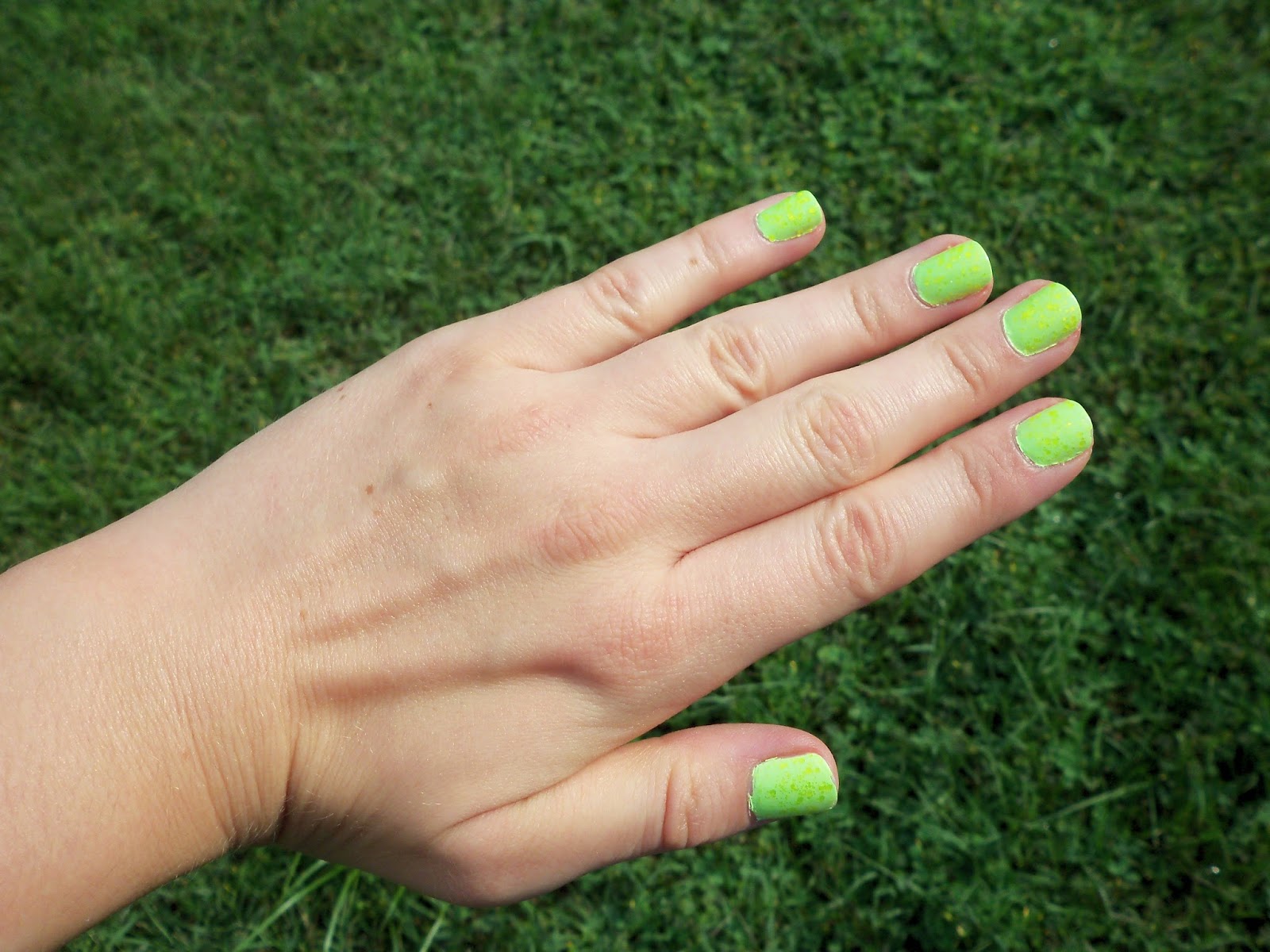
China Glaze Grass is Lime Greener topped with Urban Outfitters Yellow. The UO is a satin neon yellow glitter, a highlighter shade, not the warm, sunny color that's appearing in the photo. The effect in person was subtler, like scales on a reptile. Grass is Lime Greener appeared more of a neon spring green, slightly pistachio, before applying glitter and top coat. The neon glitter made it a look a little more lime. It's very bright! I'm looking at the bottle of it right now next to China Glaze Be More Pacific; they look nearly identical in this night time, indoor lighting, but they are NOT in reality. If I remember correctly, GiLG is more spring green, and BMP is more Shrek.

The formula for the UO glitter was very, very easy and smooth. Grass is Lime Greener took three coats, and more easily goes sloppy along the edges.


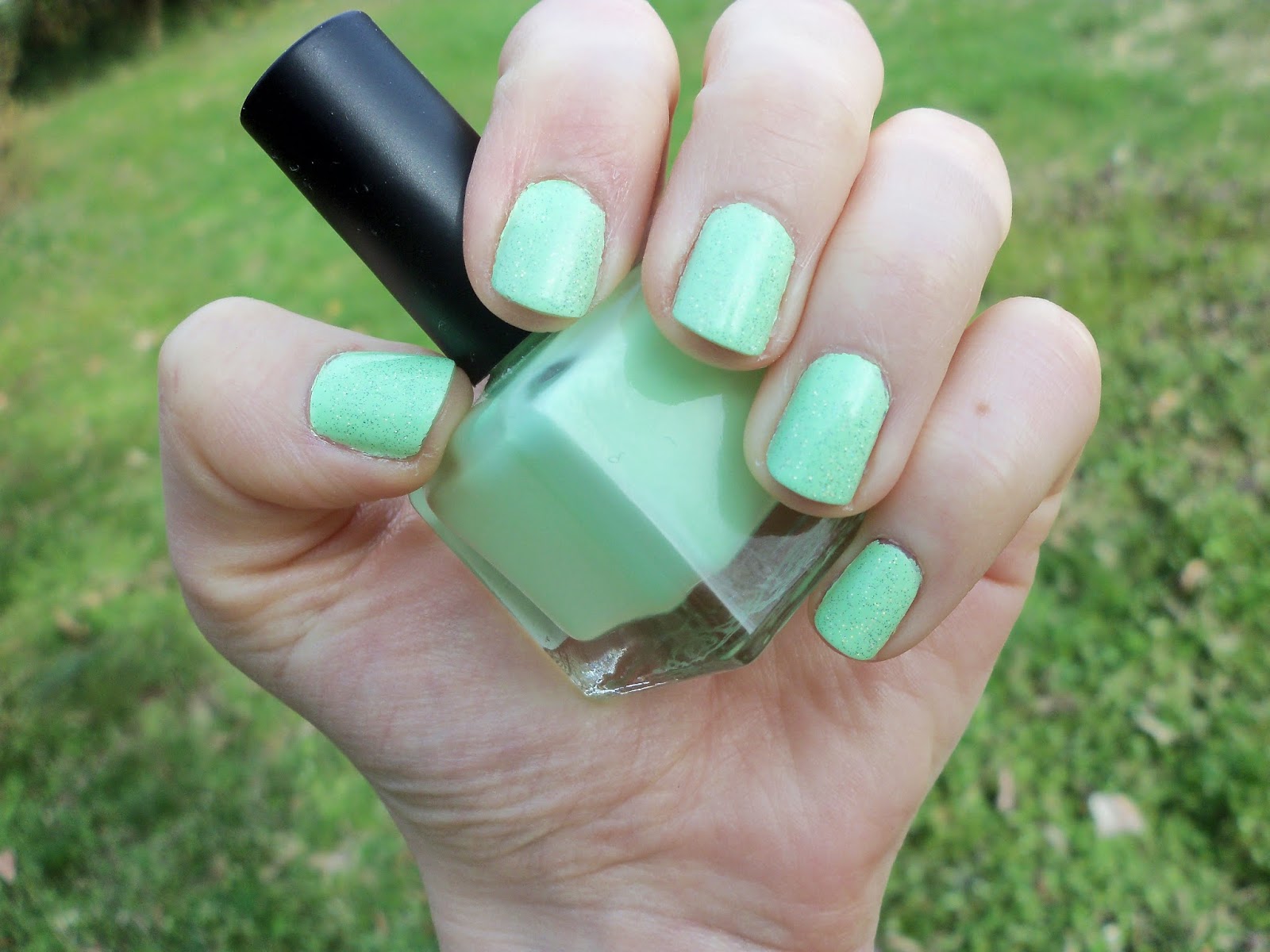
China Glaze Highlight of My Summer with Nicole By OPI Pitch Black Glimmer. Highlight of My Summer is a neon mint that I'd been craving since last summer. It sold out in Ulta right away! I think I used two coats. It was no problem at all. Of course it made me think of mint chocolate chip, so my beloved black (and silver) glitter was added. I wore Highlight of My Summer for a while as a pedicure, and it was pretty damn bright.


I heard someone online compare it with American Apparel Parakeet (which I just bought! still untried); Parakeet is much darker and more... tropical.


I believe this is a comparison with Be More Pacific. Nope, not alike.


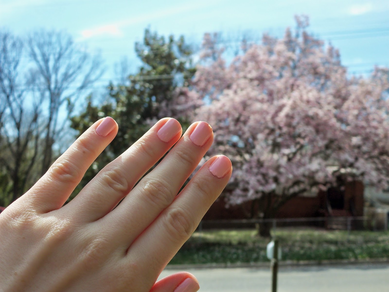
Essie Splash of Grenadine is a myrtle purple-pink! It is the exact same color. The very first time I tried Splash of Grenadine, I wasn't a fan, but this time I really liked it. I chose it specifically because the flowers were in bloom. It may have used 3 coats, but the formula was easy. The first time I used it, I don't think I found it so easy.


Zoya Destiny, coral glitter texture. Classic!


I've seen comments wondering if it was too similar to Zoya Dhara. Nope! (Dhara is also a new purchase, untried. So pumpkin spice!)


Old China Glaze Flip-Flop Fantasy versus the new. The new is obviously much more peach, and less intensely bright. It's also much easier to apply.

On that note, if you want the old FFF, I highly recommend China Glaze Thistle Be the Day. It's more pink, but very, very similar. It's extremely bright, though not as "dear god, my eyes!" as FFF.

Thursday, July 17, 2014

Oh yeah, and I'll upload a ton of photos soon.

http://mynailpolishobsession.blogspot.com/2014/07/cosmoprof-north-america-2014-american.html
http://ehmkaynails.blogspot.com/2014/07/cosmoprof-nalv-2014-china-glaze-2014.html?showComment=1405652914218#c7361176780957052839

omg

The Halloween collection looks AMAZING, and I'm loving the look for Christmas's. The dark glitters... The Halloween textures are driving me batshit wild. I CAN'T WAIT.

I've recently been window-shopping online for China Glaze, virtually all from past fall collections. It's funny how I'm not into a collection at all until two years after it comes out. I definitely need to get It's Alive, a past Halloween murky green glitter that I passed on because I thought it was too similar to one I already owned, Zombie Zest. Spoiler alert: IT ISN'T! I'm also feeling warm colors a lot more, so I think I need Desert Sun and Foxy, and maybe Loft-y Ambitions, Prey Tell, Purr-Fectly Plum, and others exactly like a billion I already own.

So basically what I'm saying here is that fall and Halloween are awesome. I love summer, and I think I'm having a great one so far (as I type this, I am soaking in the sounds of the katydids who have finally come out), but the month of October is IT, boys. It is IT!

Saturday, June 7, 2014

Short update - Zoya Charisma

I haven't updated in a while because I lost my camera yet again; I have since found it, so there will be a spam post coming up. In the meanwhile, I put on Zoya Charisma last night. I had only worn it once on the toes during the summer I got it, maybe last year, and had thought it was too dark for the season. But based on how quickly neon purples degrade (the two Color Clubs I have are now non-neon berries), I decided I better use it while I can. So I finally used it last night, and the formula was a lot more difficult than I expected. It was streaky and didn't want to stick to the messed up parts of my nail tips. After 3 coats and a top coat, I thought it looked good until I went into another room, one with less clear light, even, and there I saw it was a patchy hot mess. It looked terrible! I had to add a fourth coat of color over the top coat, plus another layer of top coat. Contrast that with Color Club Mrs. Robinson, which iirc was easy to apply and looking good after coats. Then again, Mrs. Robinson went berry on me, so there you have it. Charisma could very well be going berry as well, but it's hard to tell.

I think Charisma got chips before the night had ended, along those bad tips on my nails. By 3 PM the next day, that manicure was full-on raggedy. Very, very rarely do I change a manicure after one day of wear, but it had to be done. The color of Charisma, I will say, was just fine. I would use it for toes in the future.

Thursday, May 15, 2014

Zoya Caitlin and Essie Kisses and Bises swatch


It took me 3 coats to get Zoya Caitlin completely opaque, and that took me totally by surprise, because I remember it being nicely pigmented. It's still a lovely color! A murky purple/blue/grey/periwinkle, it's still a sweet spring spin on on the perennial autumn greige trend, good for cooler spring days or the warmer fall ones. A certain friend of mine once proclaimed that it was much prettier than "that ugly color Kelly". Harsh!

Essie Kisses and Bises is the perfect topper, and I pretty much always use it when I wear Caitlin. Weirdly I've never used it over the French collection polishes it came out with.

Essie Topless and Barefoot swatch


Lord almighty, I took these photos so long ago I don't even remember how I "experienced" the color. That's 100% my bad.

I yearned for Essie Topless and Barefoot for some time before I finally bought it, and then I didn't wear it until many, many months later. And what would make me finally put on a nude? Of course, a job interview. T&B is perfect for an interview because it's extremely inoffensive. A fleshy beige with a little bit of pink, I believe it leaned kind of tan on me like in the second photo. I took it off sooner than I "needed" to out of boredom and a need for color. I don't remember if it's 2 or 3 coats, but the formula is VERY easy.

So far with nudes, I prefer the slighty edginess of Zoya Kennedy and the... porelain-ness of Orly Pure Porcelain, but I think Topless and Barefoot probably has an easier application.

Using this reminded me of the Essie French collection and made me feel a need to rent '50s/'60s French movies. And listen to Brigitte Bardot songs. And start using the French program on Duolingo. Sidenote: French is really confusing to pronounce.

Zoya Tracie swatch


Back when it came out, Zoya Tracie looked very similar to the pistachio creme Essie Navigate Her, but I think it has a lot less of that yellow tinge that makes Navigate Her so funky and cool. Besides the silver pearl shimmer, Tracie is more of a spring green, making fellow spring green China Glaze Treehugger look like an apple green in comparison. It'd be a cute pedicure.

When I first wore Tracie, it was an easy 2-coater, but I think it thickened up a little or something and gave me some weirdness this time in application.

China Glaze Lemon Fizz and Happy Hands Motherboy swatch


These are seriously the best photos I could take at the time, blurry with indoor nighttime lighting!

China Glaze Lemon Fizz is a very light pastel yellow creme that gets easier to apply each time I've used it. Back when I got it like 5 years ago, a 3 coat yellow was a lot more intimidating, but Lemon Fizz is a piece of cake compared to China Glaze Solar Power, the most pain-in-the-butt yellow I own. Speaking of yellow, I saw yellow manicures a few times after the OPI Brazil collection came out, leading me to suspect the yellow in that collection was popular and would spark a springtime trend. I haven't seen it recently, though.

Happy Hands Motherboy is a multi-color glitter with pastel green, blue, and lilac, with comparatively bright pink. I don't think I had any application problems with it. I bought this during the very final Happy Hands sale before she closed shop. Alas! Her "Stuffed" Thanksgiving glitter was my first indie.

This was my Easter manicure, but I had to take it off like 2 days before Easter because of chipping.

Saturday, April 26, 2014

Zoya Blu swatch


Zoya Blu is a pastel powder blue creme that's lighter and more purple than the other light blues I own (Hard Candy Sky, OPI What's With the Catitude). It is also a PERFECT TWO COATS. TWO COATS!!!!! If you love pastels, I can't recommend it enough! I'm only providing one photo because it looked too cyan in the others I took.

China Glaze Spring in My Step swatch

GASP! A CHIP!

Neighbor's magnolia


It's a color match, right?

China Glaze Spring in My Step --from the spring 2014 City Flourish collection-- is a light peachy pink creme that probably looks better on me than any other light pink I own. I really, really like it. After 3 coats, I believe it had some patchiness, but it doesn't look like it appeared in on camera. I topped it with Essie Kisses and Bises, which adds a pink shimmer, but the camera doesn't capture that. When I first bought Spring in My Step, my sister, who is obsessed with anything with an essence of Japanese antiquity, declared that it should be worn during cherry blossom season. Even compared to my other light pinks, she cried that THIS was the one that matched.

Well, cherry blossom peak season at the Tidal Blossom was terrifying, even more so than usual. My group high-tailed it to Hains Point and ended up walking 7 or 8 miles overall.

Tuesday, April 22, 2014

My Favorite Zoyas

It's that time of the year: the Zoya Earth Day Exchange. This year Lent-ish no-buy has given me the strength not to partake in it; either that or the face that I've pretty much cleared out much of their catalogue already during past sales. Since I'm not purchasing, I'll instead help YOU, dear reader, by listing my most recommended polishes.

My favorite item on zoya.com is in fact their nail polish remover, but we'll ignore that.

America, a classic red creme, ranks as one of my top polishes of theirs. No other does it for me like that, not even Sooki. America is an easy 2 coats, pure opacity, while Sooki always ends with me using 3 out of frustration.

Two of the first Zoyas I ever got were Katy (my namesake!) and Gilda, and two other beloved pinks are Dita and Ali. Ali, Dita, and Katy are super easy to use and are go-tos for me, and Gilda takes a bunch of coats, but it's gorgeous. Lola is also really nice, and Kennedy with its purple undertones is my go-to nude. I have a million other pinks from Zoya in shades of light, medium, and neon, but I haven't tried them all, and some of them I have used have difficult formulas I haven't swatched it, but if you want a true Barbie pink (literally; it matches the Pantone), try Tobey.

Dree and Shawn! I resisted getting Dree because I thought I didn't need it, but I love it. I think it's a little darker than its bottle color. It's a perfect army green.

If you need a yellow, Pippa and Darcy are great choices.

Zoya has a reputation of having great purples, and I have a LOT of purples, but my favorites of theirs are Jem, Caitlin, and Marley. Throw in Pinta depending on your definition. Blues? The very best is Robyn, and my sister loves Ibiza. I recently swatched Blu for the first time, and it is 2 coats! For a pastel blue! I couldn't believe it. Highly recommended!

 Maybe another favorite? Channing. I'll give it another go this fall along with another rusty shimmer, Salma, and see.

I have a LOT of Zoyas that are still untried, so who knows. The sales over the years have led to me amassing a huge collection.

Why haven't I been uploading swatches the past week, you may ask? j/k I know like one person is reading this. But anyway I've been trying to cram in reading books every night, so uploading on the blog would be like procrastination, and those library due dates sneak up, you know. Oh, I have all the photos dutifully taken, but briefly writing some text about it takes soooo much effort. So much hard work. Can you feel my pain?

Thursday, April 10, 2014

Urban Outfitters Gotta Have It and China Glaze Fairy Dust swatch


Urban Outfitters Gotta Have It  is a bright pastel green, so bright that it borders on neon. It's amazing and super-awesome and fabulous. Surprisingly only two coats were needed on all nails but one. I'm not sure how to describe the shade of green. Is it pistachio? Mint? It's much lighter than China Glaze Highlight of My Summer, which I picked up Gotta Have It as a dupe for. China Glaze Grass is Lime Greener is much more yellow.

China Glaze Fairy Dust is of course a holo silver glitter that all of you should own by now (or own an approximate).

Monday, April 7, 2014

OPI Eurso Euro swatch

Sorry for the gross messy bits


Hanging with Handsome Jesus

OPI Eurso Euro is a dark navy-ish, maybe royal-ish blue. It leans purple enough that at least one person thought I was wearing a purple, but I think it's pretty dang blue. It wasn't as bright and vivid as I expected, like Orly Royal Navy. It's very dark, and for the first two days I wore it I thought it was too dark, especially under indoor lighting. (It usually looked more like the third photo with Jesus rather than the color in the first two.) It grew on me a lot more on the third day, after it finally looked cleaned up (but got chippy). It kind of looks like it should be a jelly, iykwim, but it didn't dry shiny. The formula is fine, but messy for me to apply using OPI's wide brush.

It's such a popular color, but it wasn't an instant-love for me like China Glaze First Mate, an awesome true navy creme. And if I want a "blurple"/indigo, I'd use Zoya Pinta. I'm considering selling it, but I want to give it another try when I'm in a nautical mood.

In other polish news, I broke my unofficial Lent no-buy! It only needed to last 2 weeks, and I think it lasted 3. I went into Sally's look for the new Sally Girl milky glitters that I saw on NoveauCheap, but not expecting to see them so soon. I came in thinking of getting Petal Pusher, but got Mulberry Affair (how "Water Lilies"-esque!) and Fresh as a Daisy instead. So I ended my no-buy with a purchase of $2! I did worse damage to it today by buying a bottle of Motherboy from Happy Hands, which is closing up shop. I believe today was her last stock refill.

China Glaze Lotus Begin and Zoya Monet swatch


China Glaze Lotus Begin is a pretty, pretty light purple that leans pink as opposed to some pretty, pretty light purples like Sally Hansen Lacey Lilac, which leans blue. Unlike my many other lilac polishes, Lotus Begins is borderline neon. It dries to a satin finish, which on its own looks pretty cool and a little edgy. It's a light purple that is definitely appropriate for summer! I'm in love.

Zoya Monet contains large iridescent-ish glitter in a variety of spring-appropriate shades (pink, yellow, blue? idk) in a very thick base. The base is tinted pink, but that's practically clear. The base is also so thick, it's unpleasant to use. It makes a gross bodily function sound when you take the brush out of the bottle, which amuses me.

I loved this combo when I wore it on my toes earlier, but Monet almost ruined it for me as a manicure. There were bubbles and unevenness in how the base of Monet applied, because you have to glob it on.

Monday, March 31, 2014

Sally Girl Mint Chip swatch


A little too dark in the blue
Sally Girl Mint Chip
A milky "mint" base, leaning towards robin's egg blue, with black speckle glitter. Without doing a comparison swatch, the base looks very, very similar to Essie Mint Candy Apple. 3 coats on most nails. The trick seems to be to glob it on without wiping excess from the brush. Such a small size for, iirc, $2 would normally seem like a rip-off, but for something novelty like this, it's the perfect amount.(Edit: It was under $1! Yes, that seems appropriate.)

My mani-pedi combo right now is full on spring pastel, and how appropriate, because it snowed today! It was completely by surprise. That was only after following the hail, which also came by surprise. Thanks, weather!

(EDIT) The Dupe: http://www.deborahlippmann.com/rockin-robin
$20?! Good lord. Yes, I recommend getting the Sally Girl version for $1 instead.

Saturday, March 29, 2014

Essie Cute as a Button / Zoya Hudson swatches

Overcast

Sunlight

Essie Cute as a Button
I think the second photo is more color-accurate. A pink-coral, darker than China Glaze Sugar High. Most nails needed three coats, particularly the stained ones. This was a lemming for me for a long, long time, probably because of the adorable name, and because I love pink-corals. It definitely felt more "mature" to me compared to my numerous others, and is maybe more orange. In the sun, it's very bright and cheery. So far, I do prefer Wet n Wild Tropicalia, which also takes only 1-2 easy coats.


Zoya Hudson
Oh, you can't imagine how anxiously I waited for the blogger swatches of Zoya Awaken to come out. Not only because I was giddy for spring colors, but because the Zoya store coupon for the collection expired only a week or two after the promotional bottles were finally received. I ended up using the code to get Hudson and the blue (plus the free Monet). Hudson in the sunlight is indeed a very pretty blue-leaning purple with gold-ish shimmer. Under indoor lighting, it takes a warmer mauve-y tone, which I'm not into. To me, it's a like a combination of Zoya Danni and Zara. I used 3 coats; it mostly looked good with 2, but I don't know, man, something told me to use 3.

Hey, I think I see some snow in the background of the Hudson pics. When Cute as a Button was worn, I think it reached the mid-70s.

I'm reaching the end of week 3 of a no-buy that's unofficially tied to Lent; all I "needed" was 2 weeks, but if I make it through all 5, I'm giving myself a hearty pat on the back. The shopping habit was getting out of control, and I had a "moment" over it coincidentally on Ash Wednesday and decided to go for it. So far it's going pretty swell and has given me a feeling of relief. Less money spent, less storage being taken up, and fewer feelings of being overwhelmed by new options when I have to pick out something to wear. It helps that I'm pretty set spring-wise. When the summer collections come out, that might not last.

The one exception I'm allowing myself, of course, is a exact dupe/replacement for Essie Lilacism.

Friday, March 21, 2014

China Glaze Sugar High, Four Leaf Clover, Medallion / Zoya Darcy swatches

China Glaze Sugar High
 In bright light it's a bright coral pink; in the shade it actually looks cool-toned, like a Barbie pink. I have a lot of medium pinks, and I don't have anything quite like it. I remember the formula being a huge pain in the past, and I'm thinking I thinned it. This time I had no trouble applying whatsoever, but it still looked patchy after the third coat. A layer of topcoat evened it all out. I don't know if it's something unique you, the reader, need to look for, but it was within that first order of China Glazes I got from Head2ToeBeauty years back, so it has ~sentimental value~ to me.


China Glaze Four Leaf Clover with China Glaze Medallion accent
Four Leaf Clover is notoriously hard to photograph, but I think this is pretty color-accurate. Maye it's making it slightly bluer? Maybe. If it's looking blue, then it is, because it's definitely green in person. FLC reminds me of the Junior Girl Scout uniform, the box for Thin Mints, and Crayola crayons, and maybe artificial green food coloring. What's weird is that on the nails with Medallion (cool gold glitter with holo bits), the green actually looked more yellow-toned. You can see it in the photo. I don't THINK Medallion's base has gone yellow... When I removed the polish, those same nails also had a nasty teal stain! Only the ones with glitter! I've worn this color/glitter combo before in the past, and I don't remember that happening.

FLC has great formula. I think I've thinned Medallion a lot, so it's definitely easier to apply than in the past, though you still have to be careful not to overload your nail with glitter.

Both of these were also part of my very first H2Toe package (before I realized there was a Sally's Beauty Supply near my house...), inspired by this post.


Zoya Darcy
Egg yolk yellow. There's shimmer, but you're not going to see it on your nail unless you stick it an inch from your eye. I don't think it's as intensely bright as it looks here.I think the photo actually makes it look better, because some of my nails were quite shite-y looking. The ones that were stained from the green + glitter combo actually TINTED the yellow a bit lemony rather than the warm color it is. After three coats! This also makes the streaks more apparent close-up. Thankfully, I don't think anyone besides myself has noticed...

I have more yellow polishes than a normal person should own, including Zoya Pippa and China Glaze Lemon Fizz, Happy Go Lucky, and Solar Power. LF is much lighter and Darcy actually looks orange in comparison to Pippa and HGL. You heard right, Darcy and Pippa aren't close to being dupes. I haven't compared Darcy to Solar Power, but it is a darker warm yellow like SP. SP is filled with thick, almost frosty shimmer, in contrast. Pippa and HGL are actually pretty close, except Pippa is more "buttery".

Out of all of these, I chose to wear Darcy because it matches the crocus in my front yard!


I'm currently waiting for it to re-bloom, that is, if the 7 1/2 inches of snow Monday didn't traumatize it.