Showing posts with label essie. Show all posts

Wednesday, May 20, 2015

Wet n Wild Wear Skinny Jeans swatch


Ahh, those raggedy cuticles.

Wet n Wild Wear Skinny Jeans is, based on all sources, a dupe for Essie Bikini So Teeny with a superior formula. A beautiful, vivid periwinkle with a shimmer you see as you apply, but disappears as soon as it dries. Brighter than it looks in the bottle and an easy two coats. Wet n Wild's wide brush made it so I only needed one stroke on some fingernails, though I was messy at the cuticles. I think the polish at the cuticles also stretched out as the nail grew. What was most surprising was how hardcore it held up. I put a lot of damage on my nails, and this polish stayed strong. It only started to chip after almost a week.

This is from the Silverlake spring 2015 collection, which I excitedly looked for but have yet to find anywhere outside of the Christmas Tree Shop, where of course I've only found the collection incomplete. A friend spotted it at an Air Force base commissary, but that's been it. The hipster names of the products are hilarious (my favorite is Warm Filter), and I love that it's named after a presumably hipster neighborhood in LA, which I hope to visit this summer.

Sunday, August 24, 2014

Summer Swatchez pt. 1


Hey, I have a bunch of swatches! Starting off is Essie Playa Del Platinum with KbShimmer Sand in My Stocking. This is the exactly glitzy sand look I'd been going for. I thought it was pretty blingy, but not one commented, so maybe not.

Playa Del Platinum is considered to be a "weird" putty color, but it looked very neutral and safe on me. I found it to be a flattering shade. It was 3 easy coats.

Sand in My Stocking is a completely unique glitter that captures the beachy feel so accurately with exactly the right combination of colors and matte and shine. The glitter looks intimidatingly dense in the bottle, but went on with a moderate amount. I easily glitzed it up with one or two swishes.


Hey, thurr's my foot.


There are a few holographic gold star sequins in Sand in My Stocking, and they mostly came out on the nails on my right hand.


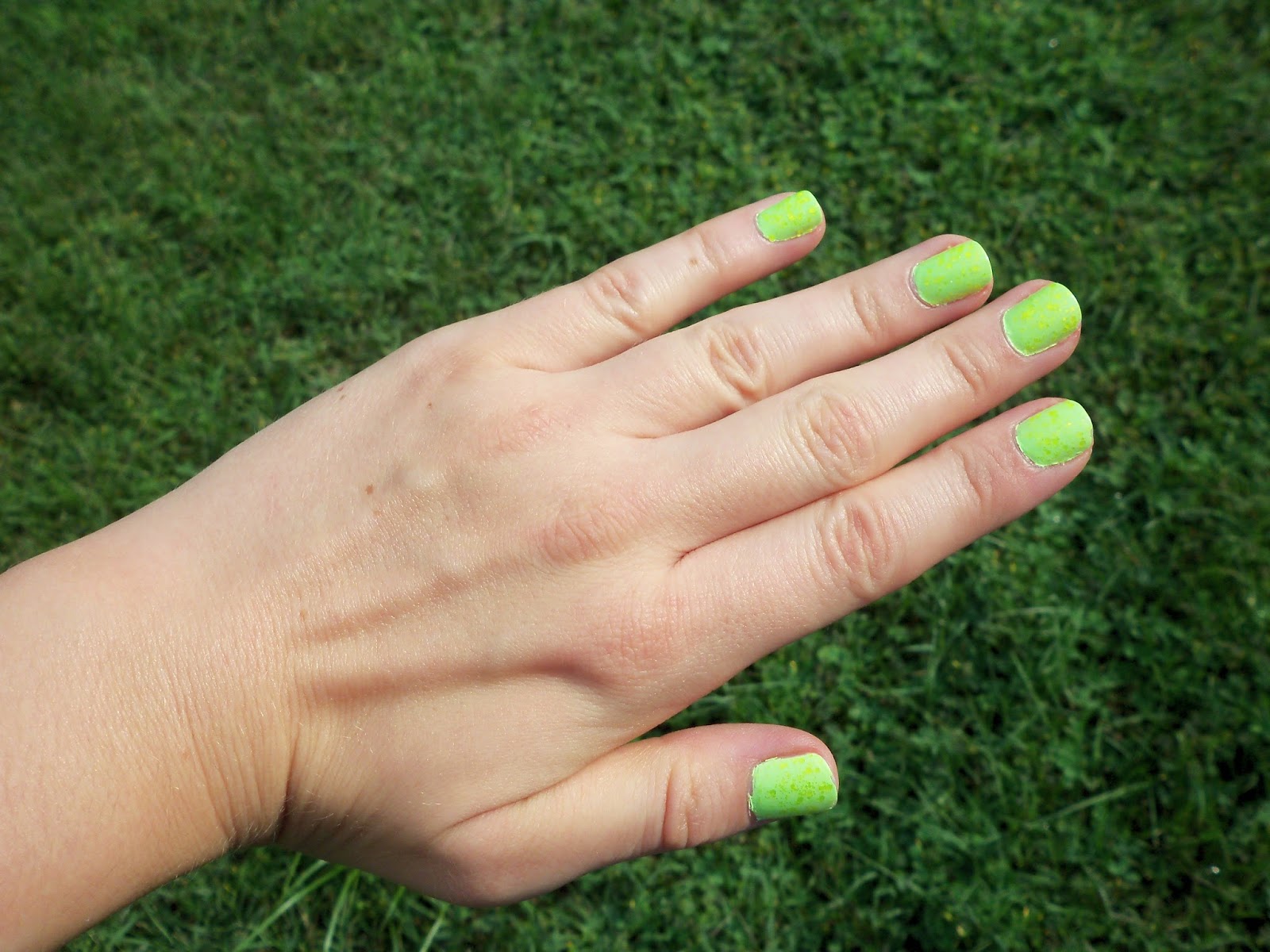
China Glaze Grass is Lime Greener topped with Urban Outfitters Yellow. The UO is a satin neon yellow glitter, a highlighter shade, not the warm, sunny color that's appearing in the photo. The effect in person was subtler, like scales on a reptile. Grass is Lime Greener appeared more of a neon spring green, slightly pistachio, before applying glitter and top coat. The neon glitter made it a look a little more lime. It's very bright! I'm looking at the bottle of it right now next to China Glaze Be More Pacific; they look nearly identical in this night time, indoor lighting, but they are NOT in reality. If I remember correctly, GiLG is more spring green, and BMP is more Shrek.

The formula for the UO glitter was very, very easy and smooth. Grass is Lime Greener took three coats, and more easily goes sloppy along the edges.


China Glaze Highlight of My Summer with Nicole By OPI Pitch Black Glimmer. Highlight of My Summer is a neon mint that I'd been craving since last summer. It sold out in Ulta right away! I think I used two coats. It was no problem at all. Of course it made me think of mint chocolate chip, so my beloved black (and silver) glitter was added. I wore Highlight of My Summer for a while as a pedicure, and it was pretty damn bright.


I heard someone online compare it with American Apparel Parakeet (which I just bought! still untried); Parakeet is much darker and more... tropical.


I believe this is a comparison with Be More Pacific. Nope, not alike.


Essie Splash of Grenadine is a myrtle purple-pink! It is the exact same color. The very first time I tried Splash of Grenadine, I wasn't a fan, but this time I really liked it. I chose it specifically because the flowers were in bloom. It may have used 3 coats, but the formula was easy. The first time I used it, I don't think I found it so easy.


Zoya Destiny, coral glitter texture. Classic!


I've seen comments wondering if it was too similar to Zoya Dhara. Nope! (Dhara is also a new purchase, untried. So pumpkin spice!)


Old China Glaze Flip-Flop Fantasy versus the new. The new is obviously much more peach, and less intensely bright. It's also much easier to apply.

On that note, if you want the old FFF, I highly recommend China Glaze Thistle Be the Day. It's more pink, but very, very similar. It's extremely bright, though not as "dear god, my eyes!" as FFF.

Thursday, May 15, 2014

Zoya Caitlin and Essie Kisses and Bises swatch


It took me 3 coats to get Zoya Caitlin completely opaque, and that took me totally by surprise, because I remember it being nicely pigmented. It's still a lovely color! A murky purple/blue/grey/periwinkle, it's still a sweet spring spin on on the perennial autumn greige trend, good for cooler spring days or the warmer fall ones. A certain friend of mine once proclaimed that it was much prettier than "that ugly color Kelly". Harsh!

Essie Kisses and Bises is the perfect topper, and I pretty much always use it when I wear Caitlin. Weirdly I've never used it over the French collection polishes it came out with.

Essie Topless and Barefoot swatch


Lord almighty, I took these photos so long ago I don't even remember how I "experienced" the color. That's 100% my bad.

I yearned for Essie Topless and Barefoot for some time before I finally bought it, and then I didn't wear it until many, many months later. And what would make me finally put on a nude? Of course, a job interview. T&B is perfect for an interview because it's extremely inoffensive. A fleshy beige with a little bit of pink, I believe it leaned kind of tan on me like in the second photo. I took it off sooner than I "needed" to out of boredom and a need for color. I don't remember if it's 2 or 3 coats, but the formula is VERY easy.

So far with nudes, I prefer the slighty edginess of Zoya Kennedy and the... porelain-ness of Orly Pure Porcelain, but I think Topless and Barefoot probably has an easier application.

Using this reminded me of the Essie French collection and made me feel a need to rent '50s/'60s French movies. And listen to Brigitte Bardot songs. And start using the French program on Duolingo. Sidenote: French is really confusing to pronounce.

Saturday, March 29, 2014

Essie Cute as a Button / Zoya Hudson swatches

Overcast

Sunlight

Essie Cute as a Button
I think the second photo is more color-accurate. A pink-coral, darker than China Glaze Sugar High. Most nails needed three coats, particularly the stained ones. This was a lemming for me for a long, long time, probably because of the adorable name, and because I love pink-corals. It definitely felt more "mature" to me compared to my numerous others, and is maybe more orange. In the sun, it's very bright and cheery. So far, I do prefer Wet n Wild Tropicalia, which also takes only 1-2 easy coats.


Zoya Hudson
Oh, you can't imagine how anxiously I waited for the blogger swatches of Zoya Awaken to come out. Not only because I was giddy for spring colors, but because the Zoya store coupon for the collection expired only a week or two after the promotional bottles were finally received. I ended up using the code to get Hudson and the blue (plus the free Monet). Hudson in the sunlight is indeed a very pretty blue-leaning purple with gold-ish shimmer. Under indoor lighting, it takes a warmer mauve-y tone, which I'm not into. To me, it's a like a combination of Zoya Danni and Zara. I used 3 coats; it mostly looked good with 2, but I don't know, man, something told me to use 3.

Hey, I think I see some snow in the background of the Hudson pics. When Cute as a Button was worn, I think it reached the mid-70s.

I'm reaching the end of week 3 of a no-buy that's unofficially tied to Lent; all I "needed" was 2 weeks, but if I make it through all 5, I'm giving myself a hearty pat on the back. The shopping habit was getting out of control, and I had a "moment" over it coincidentally on Ash Wednesday and decided to go for it. So far it's going pretty swell and has given me a feeling of relief. Less money spent, less storage being taken up, and fewer feelings of being overwhelmed by new options when I have to pick out something to wear. It helps that I'm pretty set spring-wise. When the summer collections come out, that might not last.

The one exception I'm allowing myself, of course, is a exact dupe/replacement for Essie Lilacism.

Saturday, March 8, 2014

Zoya Julie swatch


Zoya Julie
A light lavender with pearly white shimmer. 3 coats for pigmentation. I wondered at first if it looked too grey, but right now I'm satisfied.

A long story:: I had been picking up and putting back down this color at Ulta since it came out. Since the summer, there has always been two lonesome bottles of it just sitting there. My friend got it in a monthly gift set last year and loved it, and it looked pretty at her, but I have enough lavenders, right?

Then my beloved mini-bottle of Essie Lilacism became half-empty. I picked up a full bottle at Target, and a month later I realized it did NOT match the mini. It looks kind of like a faded, muted version. The pigment in Lilacism is so unstable, I have literally seen 3 different variations of it in one display. But I thought I was safe because it matched all the other ones in the display at Target. Alas!

I took my mini bottle to Ulta a few days ago looking for a replacement, and the display for Lilacism was empty! The same was at Target. What's going on with that?! The closest color I could find was in fact one of those lonesome bottles of Zoya Julie. The shimmer makes it obviously different, but the base is very, very close.

I'm still open for a replacement (unless I can get a matching bottle of Lilacism). OPI Rumple's Wiggin' is often compared to it, but it's noticeably pinker. Back when the two colors came out, I definitely preferred Lilacism. But I'll give it another try... that and the million other light purples in my collection.

Also, I took these photos while wearing a t-shirt, comfortably. I love you, Spring.

Also also:

Tuesday, February 4, 2014

China Glaze At Vase Value swatch and comparisons, from the City Flourish collection

China Glaze At Vase Value
 A baby blue/aqua creme, very, very bright.  After three coats it's completely fine.  It's thicker and dries quickly, which can cause difficulty, but eh.  Not too big of a deal.  I added China Glaze's silver crackle to winter-fy it.  The sloppiness is all my doing.

Some comparisons:
For Audrey, At Vase Value, and Too Yacht to Handle. AVV is way, way lighter. FA  looks almost dull in comparison (the sunlight is making it more vibrant). TYTH is like a much deeper version of the same shade.


Versus China Glaze Refresh-Mint, which is greyer and more green.

Essie Mint Candy Apple, which you can see is greener.  It's kind of the same level of brightness and lightness, the mint to At Vase Value's aqua.


It's definitely a SPRING color, a little too vivid than I can handle at the moment. It'd make an awesome pedicure. Maybe add some Fairy Dust, and you're set to go.

Wednesday, January 15, 2014

More old swatch photos


 Christmas 2011, China Glaze Jolly Holly and Party Hearty
This is my go-to Christmas manicure. Still doing it every year. This time I skittled it up and only did it on certain nails, so I could fit in more varieties of Christmas tackiness all in one manicure.


 China Glaze Phat Santa with Party Hearty
Phat Santa is a really nice, slightly dark red creme. I should really wear it more often.


NYE 2011-12 China Glaze  First Mate with China Glaze's silver crackle
 First Mate is a perfect navy creme. Perfect!!! This manicure is exactly what I had wanted for NYE that year. The color of the navy in the photo looks a bit too light.


 Zoya Pinta with Essie Shine of the Times
I think Pinta is one of those notoriously hard-to-photograph "blurples". It's a dark creme indigo, and it's a pretty great color for the winter. Notice that it looks purple on the thumb and navy blue on the finger in the background.


Zoya Yasmeen with Essie SotT
Yasmeen  is a highly hyped warm purple shimmer, and it didn't do much for me at the time.


 China Glaze Ingird
 Taupe with subtle shimmer. I believe it's a dupe of a Dior, so to me it feels very ~expensive~.


Finger Paints Military Green
Awesome sage green creme. Love! The pigments separate very easily in the bottle, and FP have a cap that's very difficult to open, so that's my one complaint.


Essie Mint Candy Apple
A bright mint with a lot of blue tone. Surprisingly easy to apply. When I wore this that winter, I felt it looked very summery aqua and seasonally inappropriate for the winter, even though it was originally released for the holidays.


 Sally Hansen Xtreme Wear Celeb City
Silver foil, three coats. Classic.


 China Glaze Jitterbug with China Glaze Some Like it Haute
 Jitterbug is a charcoal foil, a bit blue-toned, and Some Like it Haute is a slightly glitter version with chunky holo glitter. Jitterbug is alright. Some Like it Haute was a pain the first time I wore it, requiring loads of top coat and then chipping off in chunks, but layered over Jitterbug, those problems are taken care of.


Zoya Kennedy
 A slightly purple pink fleshy nude creme. This looks good on me.


Miss Sporty Raindrop
A tourist purchase from England! A teal creme, that takes maybe three coats, so it gets darker than it looks in the bottle (and probably darker than in the photo). Essie Go Overboard is lighter and more pigmented.

Some old swatch photos

Since I found my camera, I'm digging through the 2-year-old photos on the memory card, and naturally there are many polish swatches.

Essie Van D'Go
A peach-pink creme. I applied it very thick iirc, and I had mixed feelings. I'd like to give it another shot.

China Glaze Dance Baby and China Glaze Crushed Candy
I love this combo! Dance Baby is a light, bright, blue-toned pink, and Crushed Candy is a robin's egg blue crackle, like For Audrey. Together they make a very late '80s, early '90s, "Saved By the Bell"-esque look, and the crackle really works in that favor.

Outside of a Panera Bread in Williamsburg, VA!
Zoya Dannii
A purple shimmer. This was so highly rated at the time, but I wasn't really feeling it, and I LOVE purple. I think it mainly only looked great in direct sunlight. It's another one I'd like to give another try.

China Glaze Riveting
Orange jelly glitter. Awesome. I prefer this in autumn over the summer.

China Glaze Smoke & Ashes
Black with teal shimmer. I was disappointed with this at the time of this photo because the shimmer wasn't as apparent as I expected. But recently I used it as a base for China Glaze Electrify, and even before I added the glitter, I loved it. Opaque in one coat, very easy to apply, it's just a great dark color. It's no longer on my "possibly sell" pile.

Zoya Caitlin
Purple-grey-blue creme, much lighter than Zoya Kelly. This was definitely my favorite out of that Zoya spring collection. It also looks awesome topped with Essie Kisses and Bises, another polish that was new that spring.